
But it is to Excel I owe my dramatic heading. I am desperately trying to figure out what is wrong with my hard disk drive (I've sure written a lot about it on this blog). In order to see things clearer I decided to collect data from the hard disk drive and analyze it. With over 400 different data I try to make sense of it by plotting it in graphs. Since I stored all my data in Excel plotting the graphs would not seem to be a problem. I now have four different graphs, and they were easy to plot. But most important of all: they look good. And that was the problem. The points were evenly spaced although I recorded the data at completely irregular times.
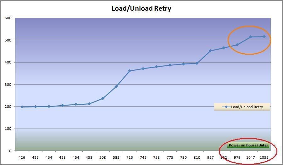
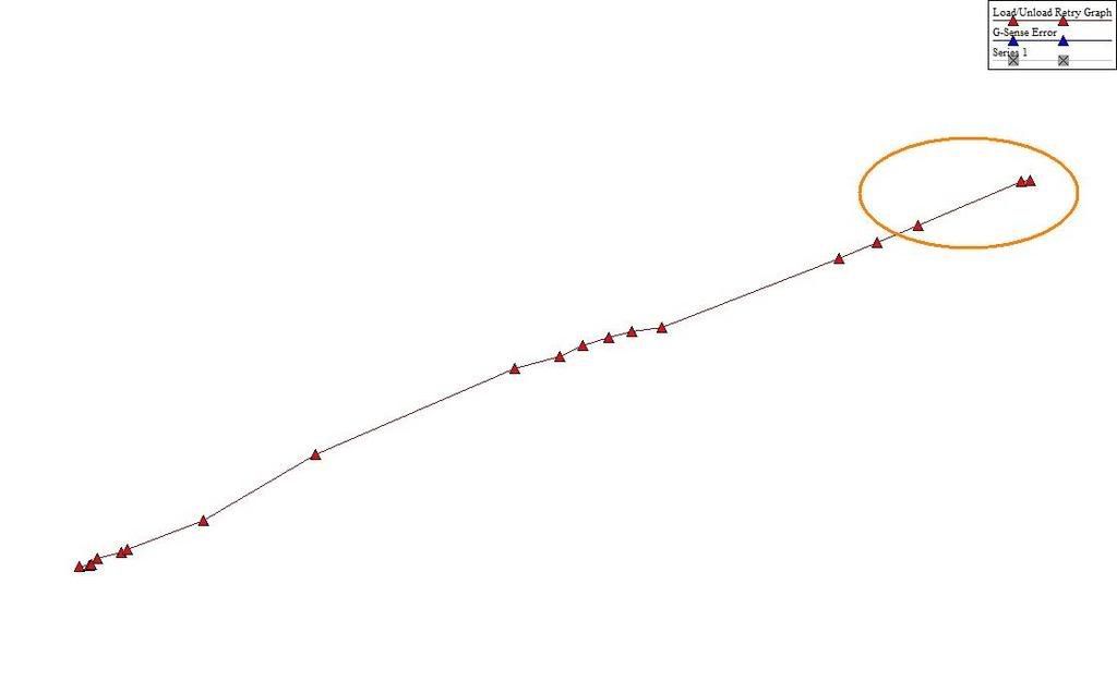
Slightly surprised I ploted the data in Graph 4.3 instead, and the graph looked very different, but this time it was at least correct. How (in the name the god, that doesn't exist?) can Excel, which is used by millions of users, plot a graph that is incorrect? Maybe there is a hidden function which solves the spacing problem, but shouldn't Excel show the proper spacing by default? My trust in Microsoft is officially non-existent. Whenever I got the time, I'll switch to Linux. Bite me Microsoft!
And oh! I think I know why the Koreans at Samsung did not respond to my "scientific" investigation of their hard disk drive. I was stupid enough to include a copy of my good looking, but incorrect, graph… plotted in Excel.
No comments:
Post a Comment